|
Methodology
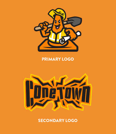
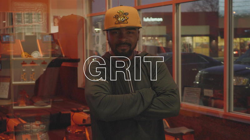
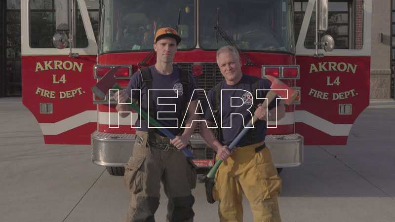
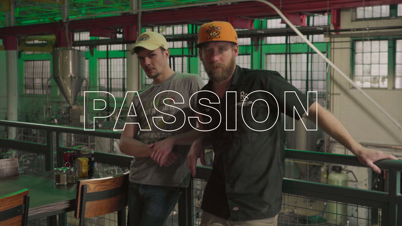
When coming up with the idea for ConeTown USA, the RubberDucks wanted to tastefully poke fun at the on-going Downtown Akron construction while tying in the organization’s “Affordable. Family. Fun!” brand identity. With the help of Brandiose, we brainstormed and conceptualized the idea of ConeTown USA as the official rebrand title. The logos designed for this project were aimed to embody the tough, blue-collar, personality of Akron, OH in a fun, lighthearted way. Key words like grit, heart, passion, and innovation were used to lead the design process. |
|
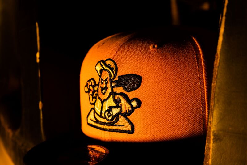
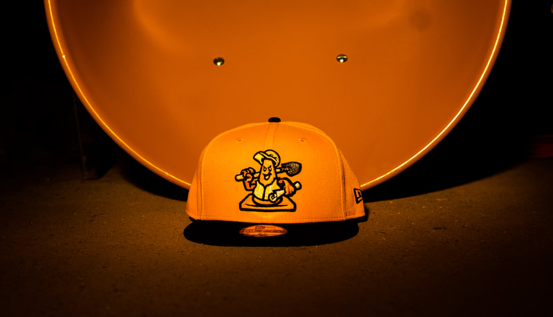
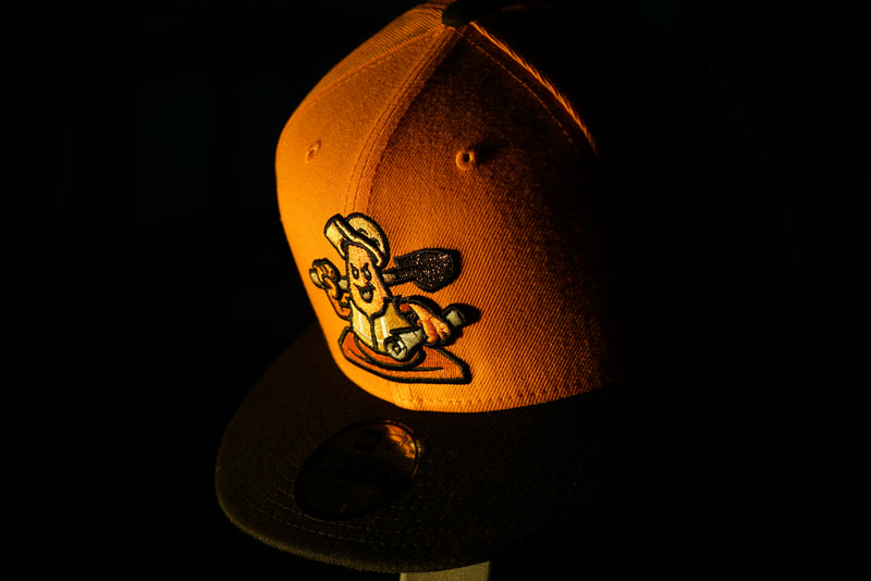
Branding & Execution The goal of the project was to highlight the years of growth and progress the Akron community has made in infrastructure, education, and economics while subtly poking fun at the ongoing construction that has helped get us to new heights. The branding for the release video, artwork, and product shots was centered around the Akron identity and the various community members that contribute to the city’s vibrant future. |
|
